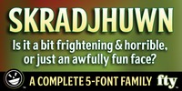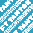
SKRADJHUWN is a font that refuses to be classified. It bounces casually along its baseline with the weight of a display face, showing off hints of fun serifs and curvey strokes. Yet it’s visually strong and a great reader, and it’s also a family of five faces.
The subtle variety of weights allows the user to pick just the right amount of heavy or light for maximum visibility at any size. SKRADJHUWN, in base-form, will work just about anywhere you want to use it.
Except maybe those very small point sizes that tend to chew a regular font to pieces. For those delicate moments, drop down to the thinner strokes of SKRADJHUWN 001 and 002. From there, with the 003 and 004 option, the strokes increase dramatically, allowing the user to avoid those pixelated defects that arise when letter size starts to clash with the final viewing size.
More…
SKRADJHUWN even includes some nice character options for our German-speaking customers--the uppercase Eszett and an alternative to the standard lowercase eszett.


